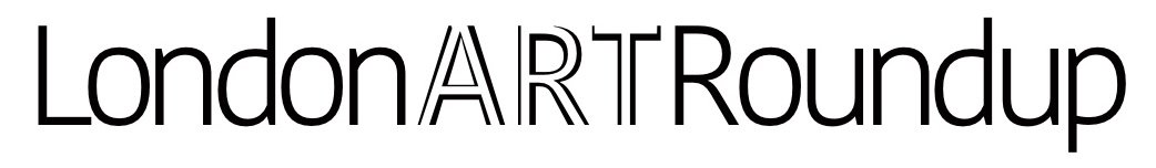
King Charles III (2024)
Jonathan Yeo (b.1970)
King Charles III, 2024
oil on canvas
190 cm × 259 cm
Drapers’ Hall
For this work I’m breaking my very first rule for this column. I like it, but it isn’t a work that I “really, really” like. However, as it’s been so ridiculously contentious since the moment it was publicly debuted I just had to go see it and weigh in because so many reviews have been scathing. Is it really all that bad?
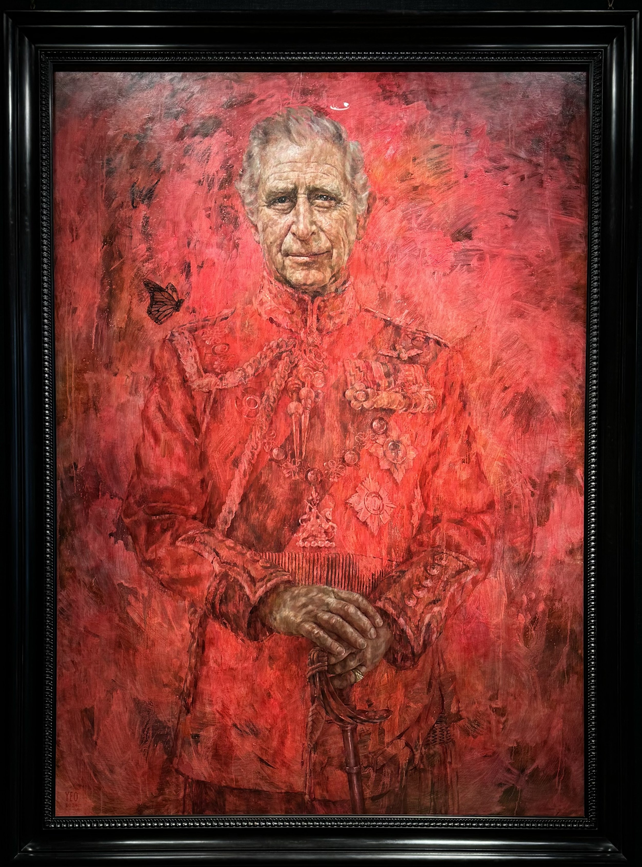
Let’s start with the basics: artist Jonathan Yeo has nailed it as regards the King’s likeness. I’ve never met the man in person but this looks exactly like the Charles that I’ve seen countless times in the news. He’s even captured those stubby sausage fingers which I never really paid much attention to and now really really wish I could un-see. Someone standing next to me in the gallery commented that he’s not wearing a wedding band, but if you look closely you’ll see that he is. He wears it on his pinky. I also really like the fact that the hands and face are stylised just enough to avoid the kind of photorealistic effect that always invites more scrutiny than it should. I get an uncanny-valley feeling when I look at Jamie Coreth’s portrait of William and Catherine but with Yeo’s approach no one’s going to get stuck in a droll debate about whether or not the artist beautifully captured the King’s ear hair. It’s Charles. End of.
As for the expression, I honestly can’t tell if he’s sad, somber, slightly smirking or simply resigned. Maybe he’s just weary? This is, after all, a man who spent 74 years of his life preparing for one thing and one thing only. He first sat for this portrait in 2021 when he was still Prince, but it’s impossible not to view it through the lens of a reigning monarch. Speaking of which, that monarch butterfly was Charles’ suggestion as a nod towards his environmental activism and is the only visible symbolism you’ll find. Oh sure, there’s plenty of military regalia pinned on his Welsh Guards uniform, but they and almost everything else in this portrait except for Charles’ head and hands, recede into the background under a wash of pinky-red. Which brings me to why I like this work.
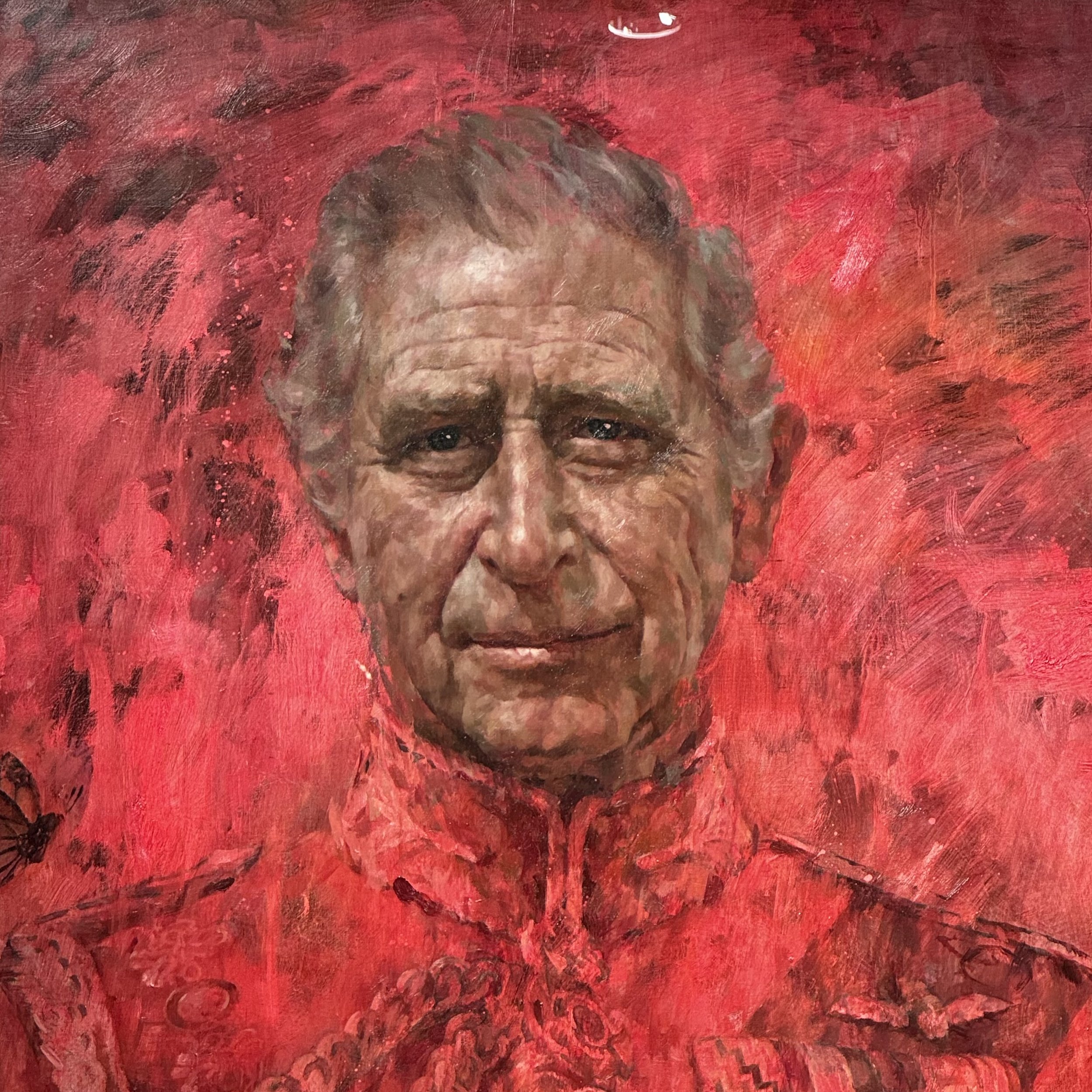
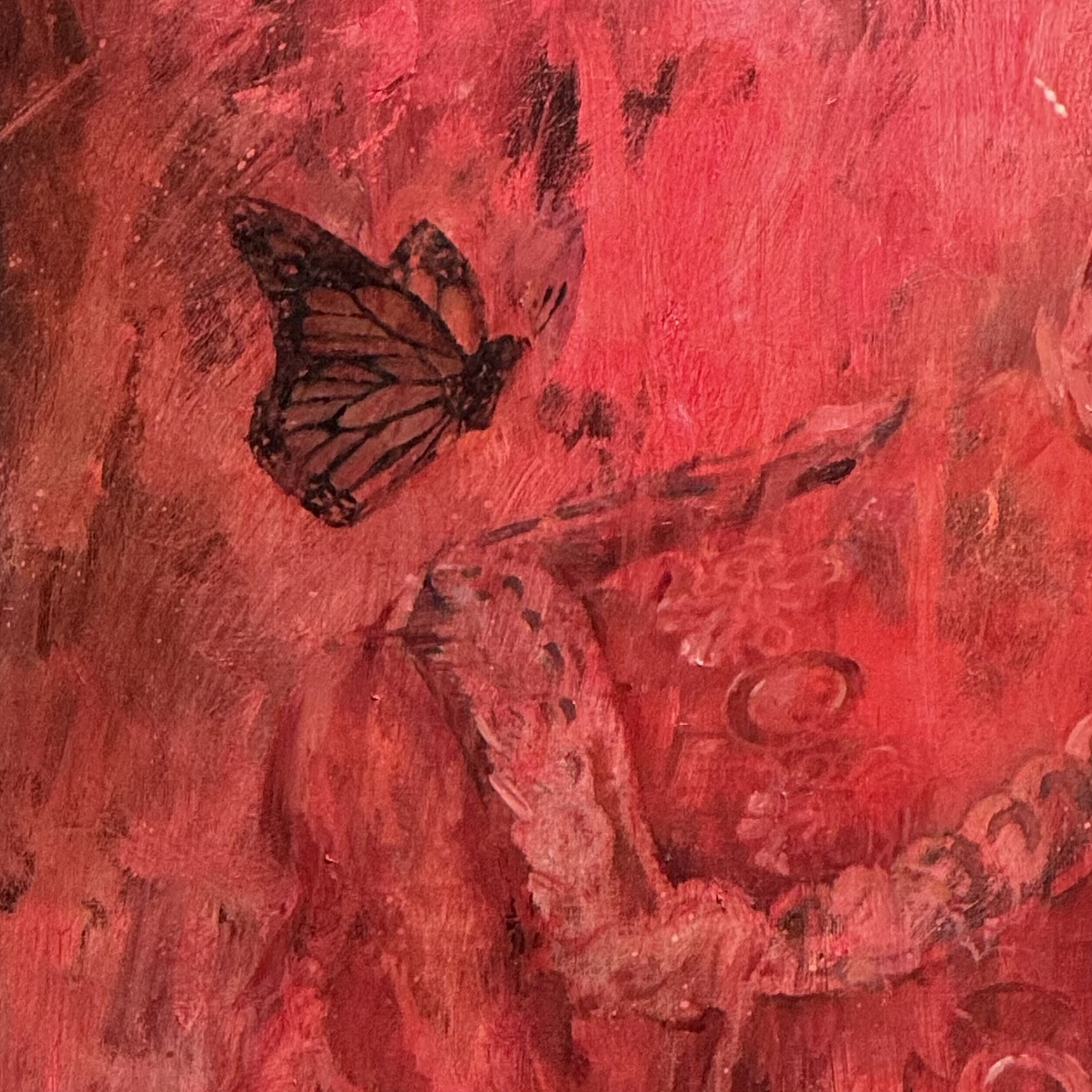
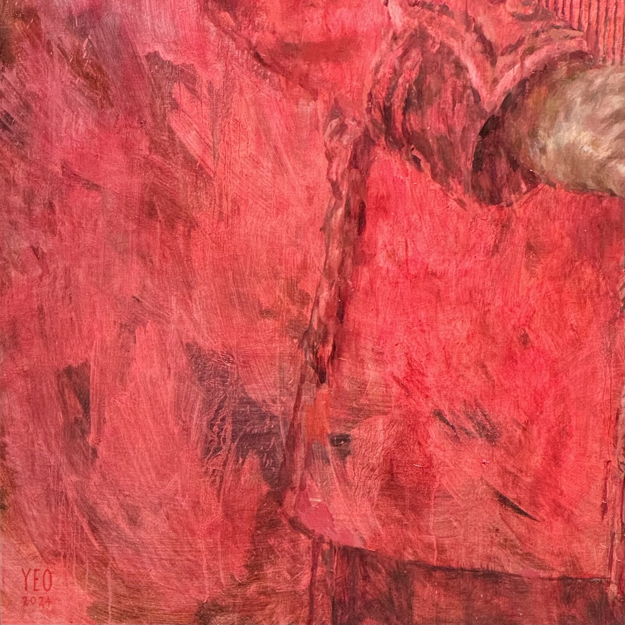
When I went to view it I spent a lot of time staring into the King’s eyes. Enough that it would have been an uncomfortable experience for both of us had this meeting taken place in person. It felt natural, though, and I attribute that to Yeo’s artistic trick of rendering almost everything in a single colour. Yeo is known for that approach and if you peruse his past catalog you’ll see that it often appears gimmicky, but in this instance I think it’s a bold move since it downplays visible evidence of status. Countless royal portraits throughout history specifically did the opposite to remind you of power and stature. Royal portraits are also generally larger than life. If this painting were to scale than Charles would stand ~3.5 metres or 11’9” tall. By literally painting away all of the details except for an oversized head and hands, Yeo focuses our attention on the King’s mortal, fleshy humanity. (Thank God this wasn’t a summer beach portrait!)
Setting aside the ego and importance that a royal portrait entails, it’s telling that Charles would commission a painter known for that approach. I’m not going to argue that it’s a humble statement, but it does seem to me to be Charles’ way of trying to remind us that the man now on the throne is, and has been, much more than the uniform and titles that have been bestowed upon him. He’s now the king, but he’s also just a man.
Whatever your views on the monarchy you have to admire their staunch dedication to tradition. They may go out of their way to appear to be ‘of the time’ but there’s actually very little leeway allowed in any and every aspect of the organisation, and that extends to the arts. From Hans Holbein’s genre defining portrait of Henry VIII to Tatler’s most recent efforts to lower the quality bar, royal portraits have remained fundamentally unchanged for the last half century. And that’s another reason why I like Yeo’s red-washed approach. It is distinctly different from almost every royal portrait that has come before, and yet it fundamentally adheres to a time tested format.
That’s why I like it.
The more things change, the more they stay the same.
Additional reading:
About the portrait (via artist’s website)
Plan your visit
Jonathan Yeo's portrait of Charles III is on view at the Philip Mould Gallery (@philip_mould_gallery) until Friday 21st June, 2024.
Free. No booking required.
It will take up its rightful place at Drapers’ Hall (@drapershallevents) from the end of August, 2024.
Previously, on Why I Like It:
May — Penguin Pool (1934), Berthold Lubetkin
Apr — V&A Rotunda Chandelier (2001), Dale Chihuly
Mar — Black Square (2003), Gillian Carnegie