David Hockney at Lightroom
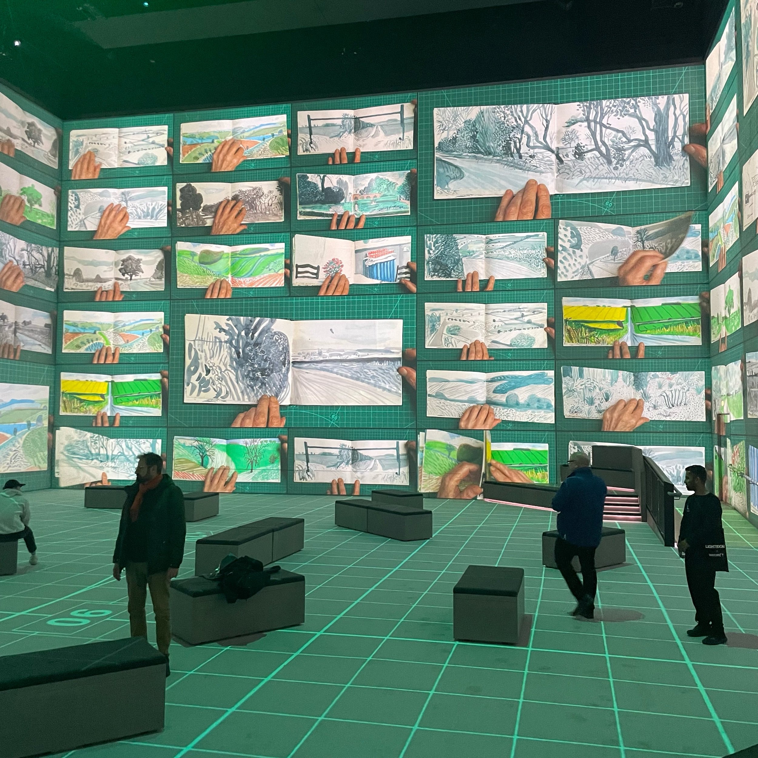
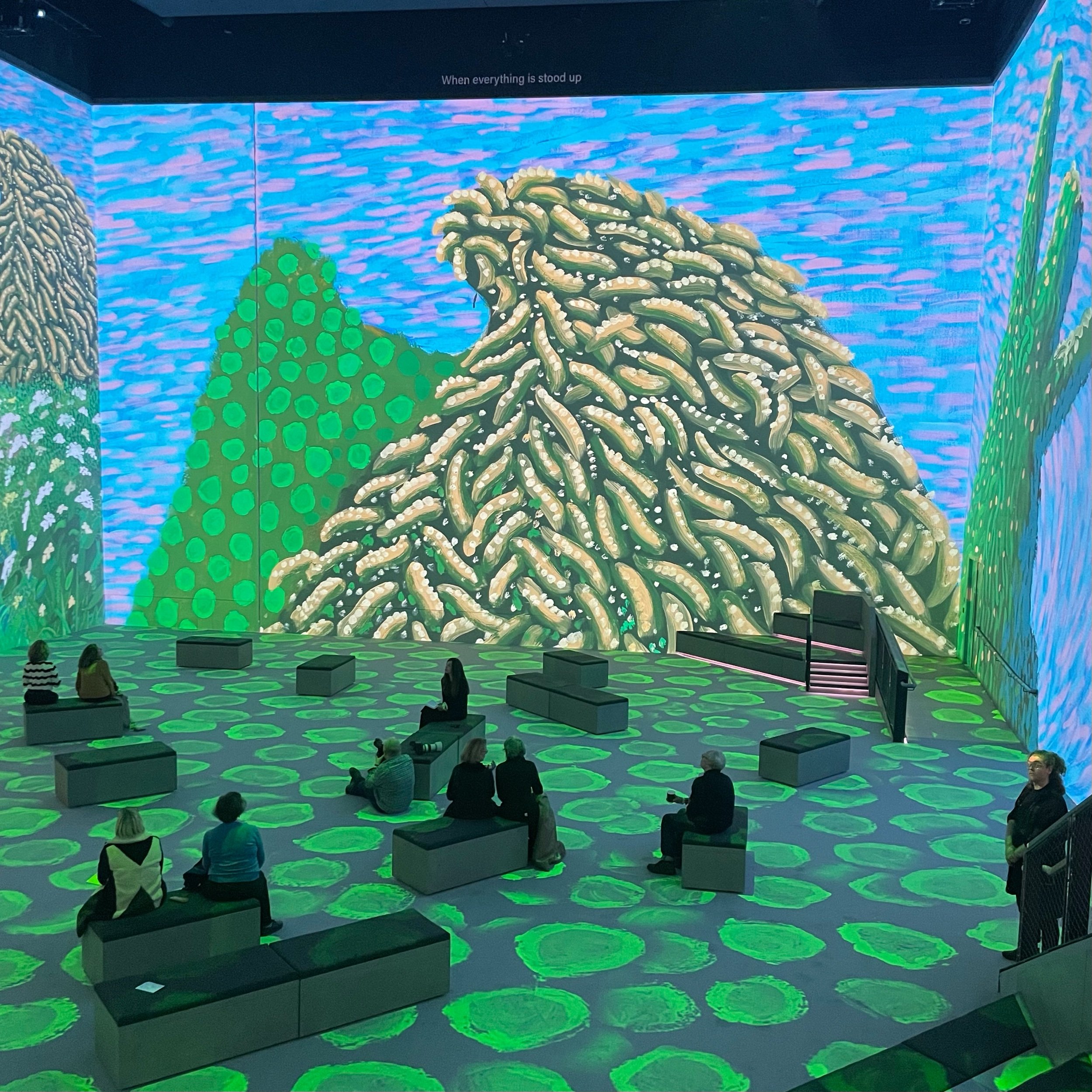
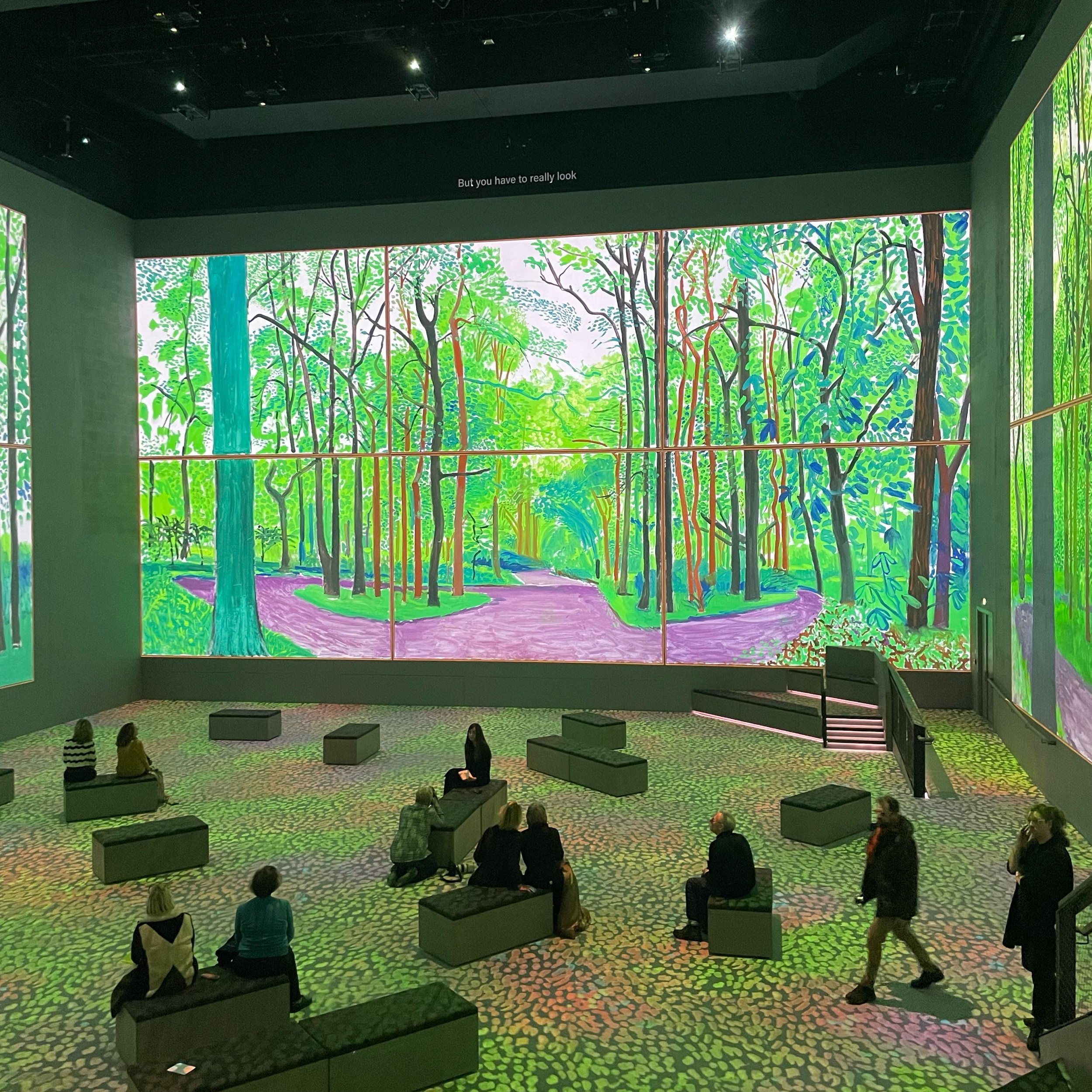
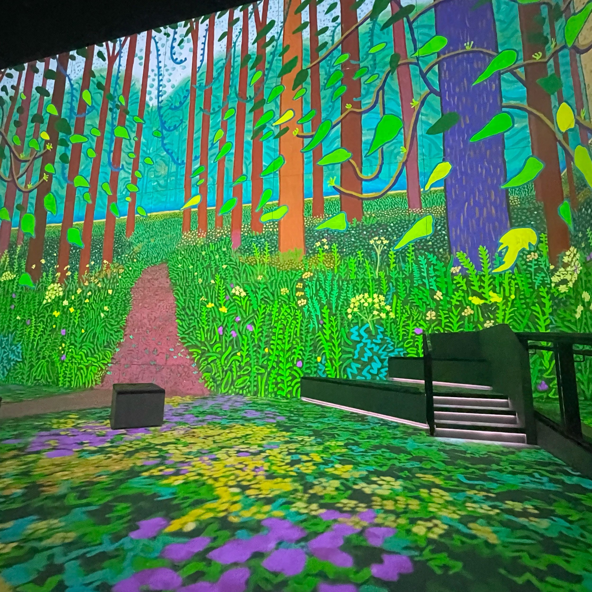
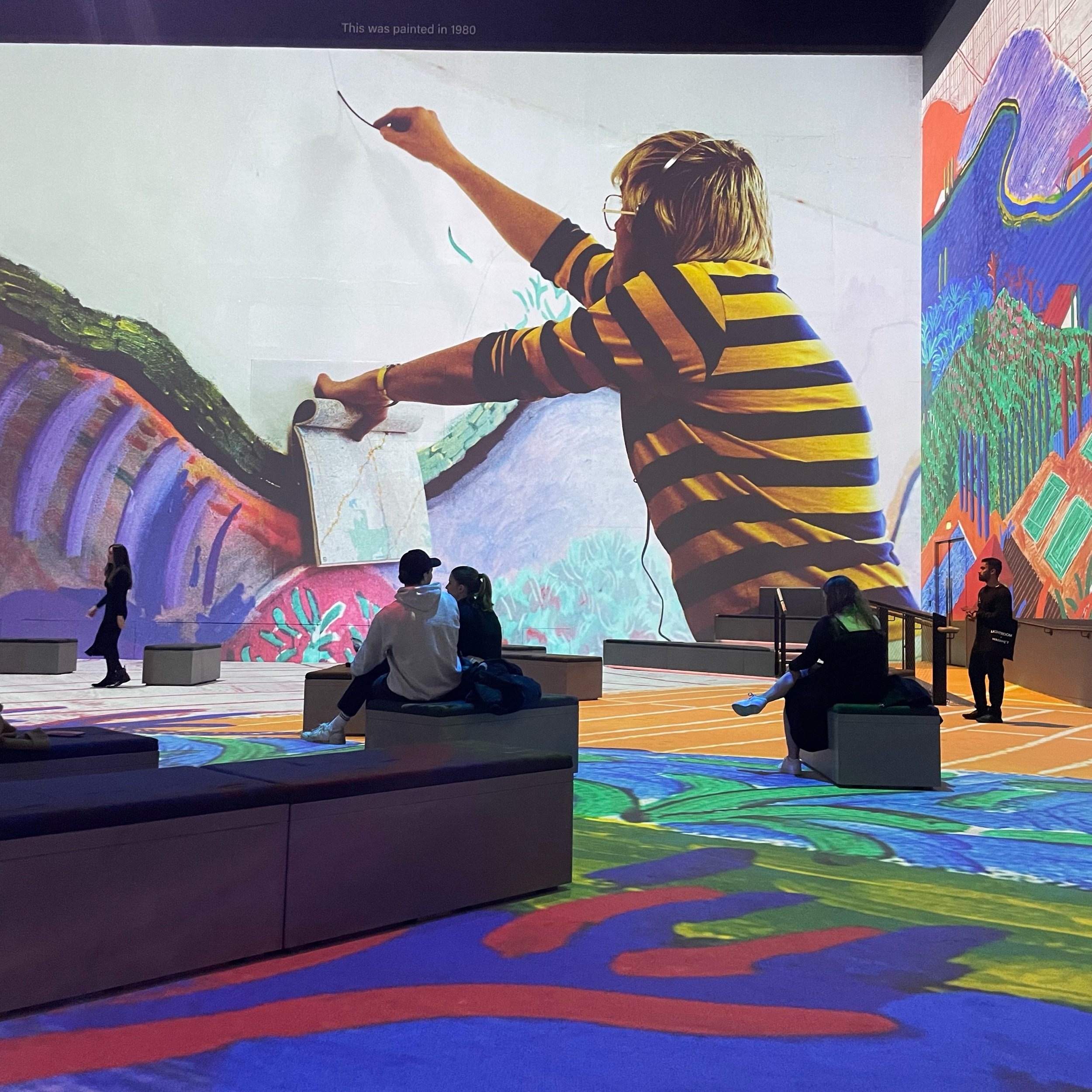
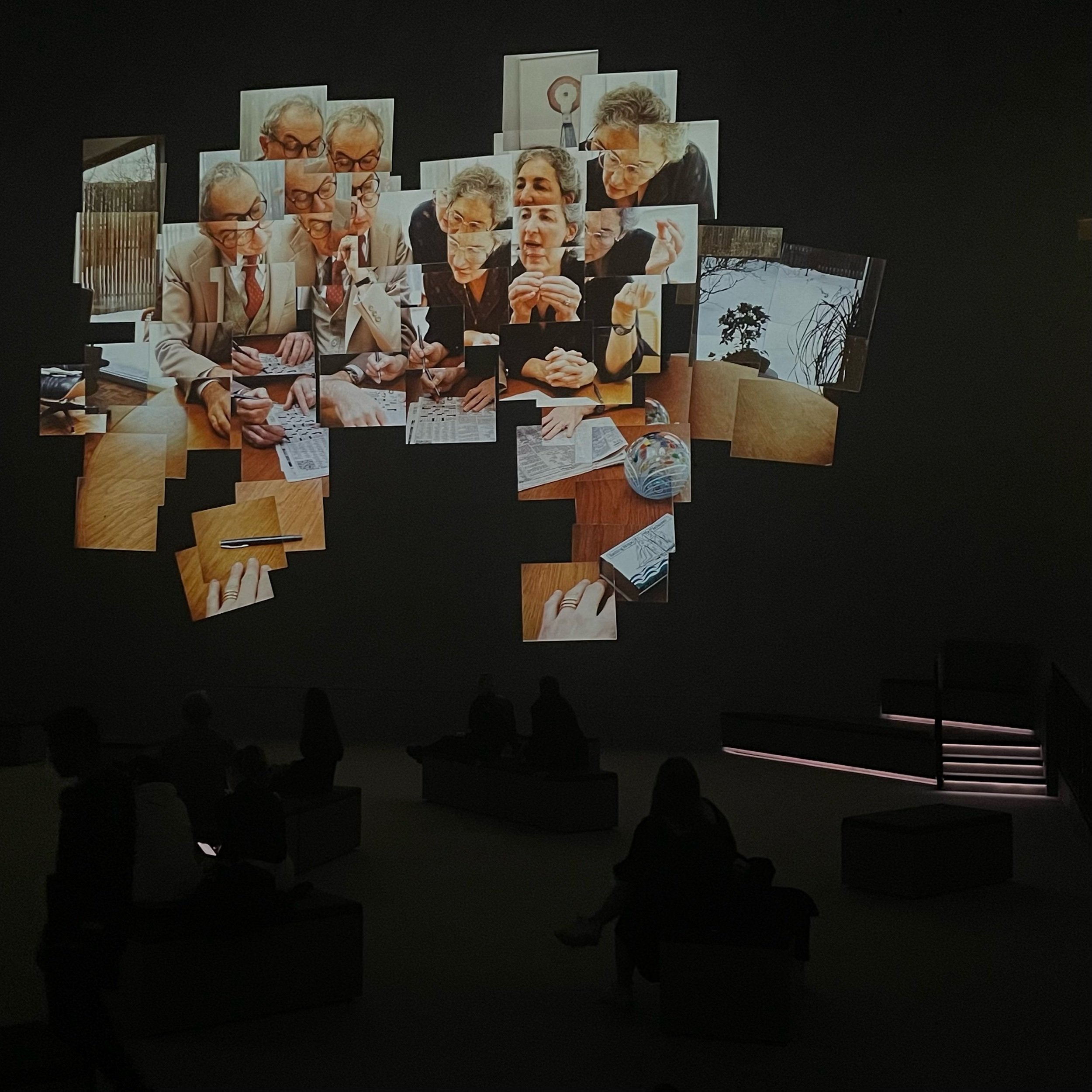
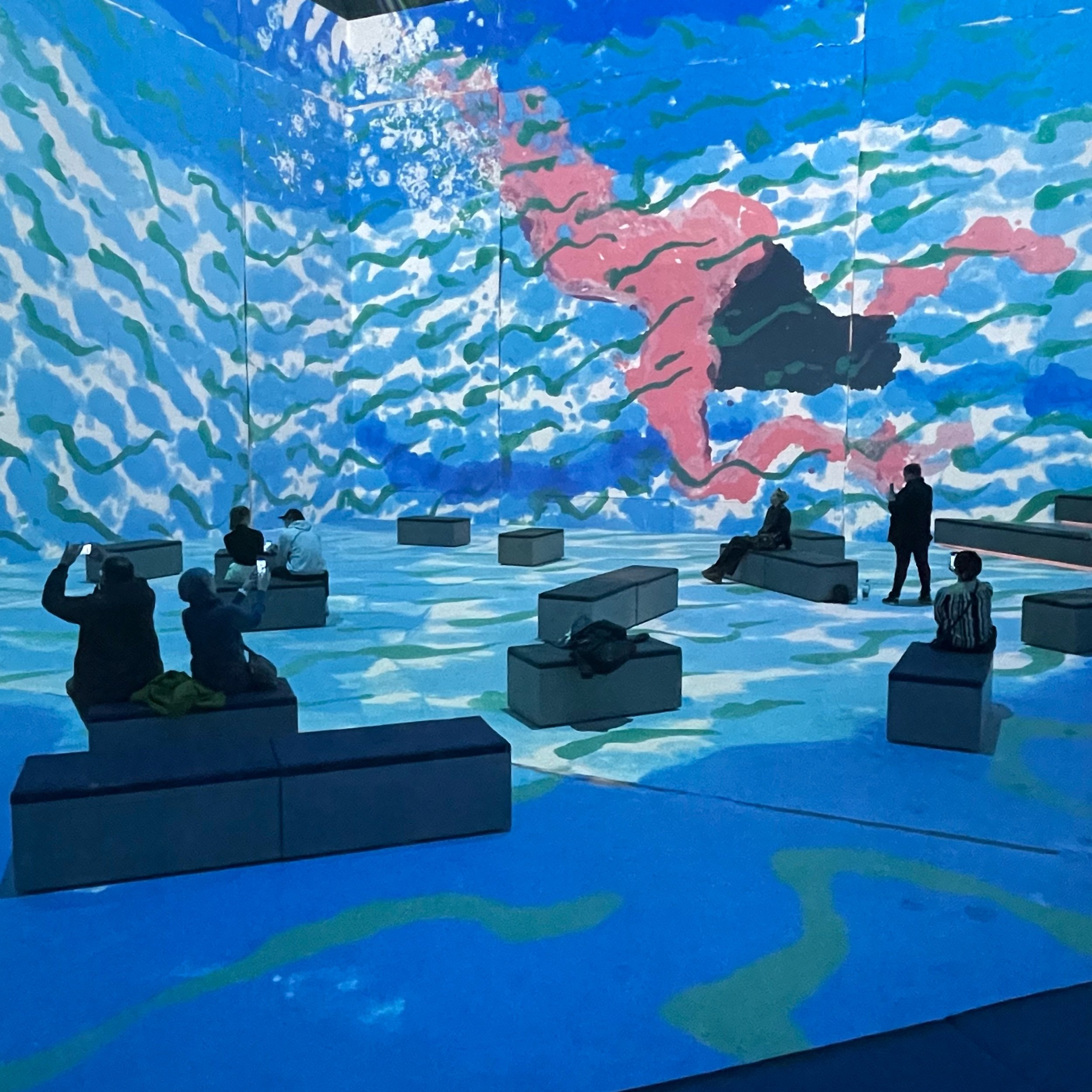
‘David Hockney: Bigger & Closer (not smaller & further away)’ is the debut show at Lightroom, London’s newest, dedicated immersive experience venue that opens today. The viewing room is a sight to behold: an uninterrupted underground space, four stories tall with state of the art sound and incredibly crisp projections on the walls and floor. It’s been designed as a space where artists are invited to play at larger than life size. Hockney, the debut collaborator, opted “to take the audience on a personal journey through his art”. He’s an artist with a well established career of being inquisitive and open to exploring how new technologies can evolve his work going forward, but this show is mostly a passive look back.
One of the joys of these types of immersive artist experiences is the way modern designers cut & paste distinct visual elements from the works, then use animation to bring new life to static art. They’re not always good and often cited as sacrilegious, but it’s these unexpected moments that make them fun, enabled by modern technology and the public domain. Without copyright or the watchful eyes of an artist’s estate, anything goes. Hockney is still very much alive. He closely collaborated on this show and I suspect had a firm hand in ensuring the sanctity of his works was never compromised.
Hockney fans can probably guess how they’ll be animated almost as soon as they appear. And if you haven’t seen his works before, well, now you have. All the hits are here, mostly shown true to their original vision. Animations are limited. I was disappointed that not much happens other than project them really, really big. With accompanying narration by Hockney himself, much of it taken from archival recordings, the “experience” is essentially an hour-long documentary. Thankfully, there’s a generous supply of cushioned seats.
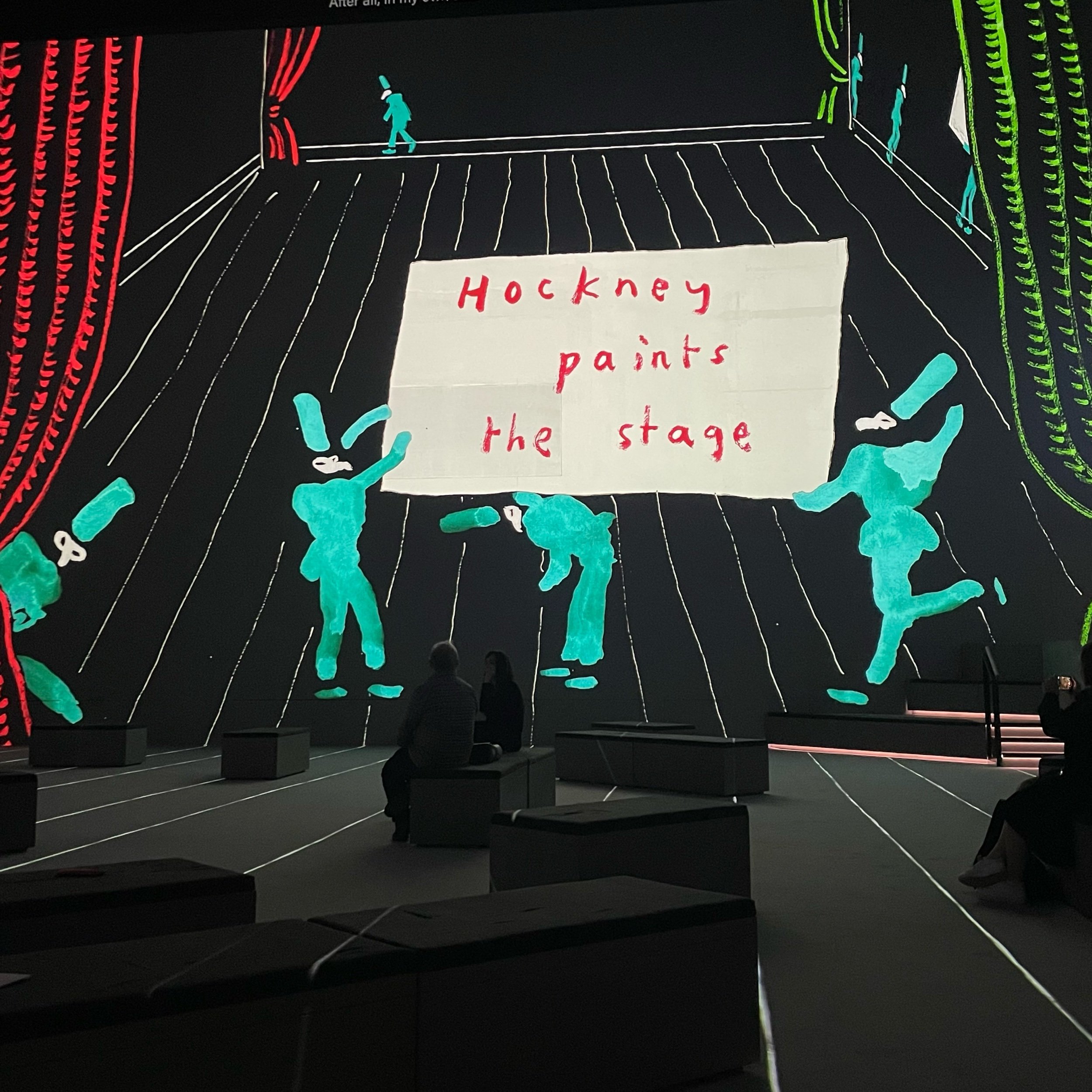
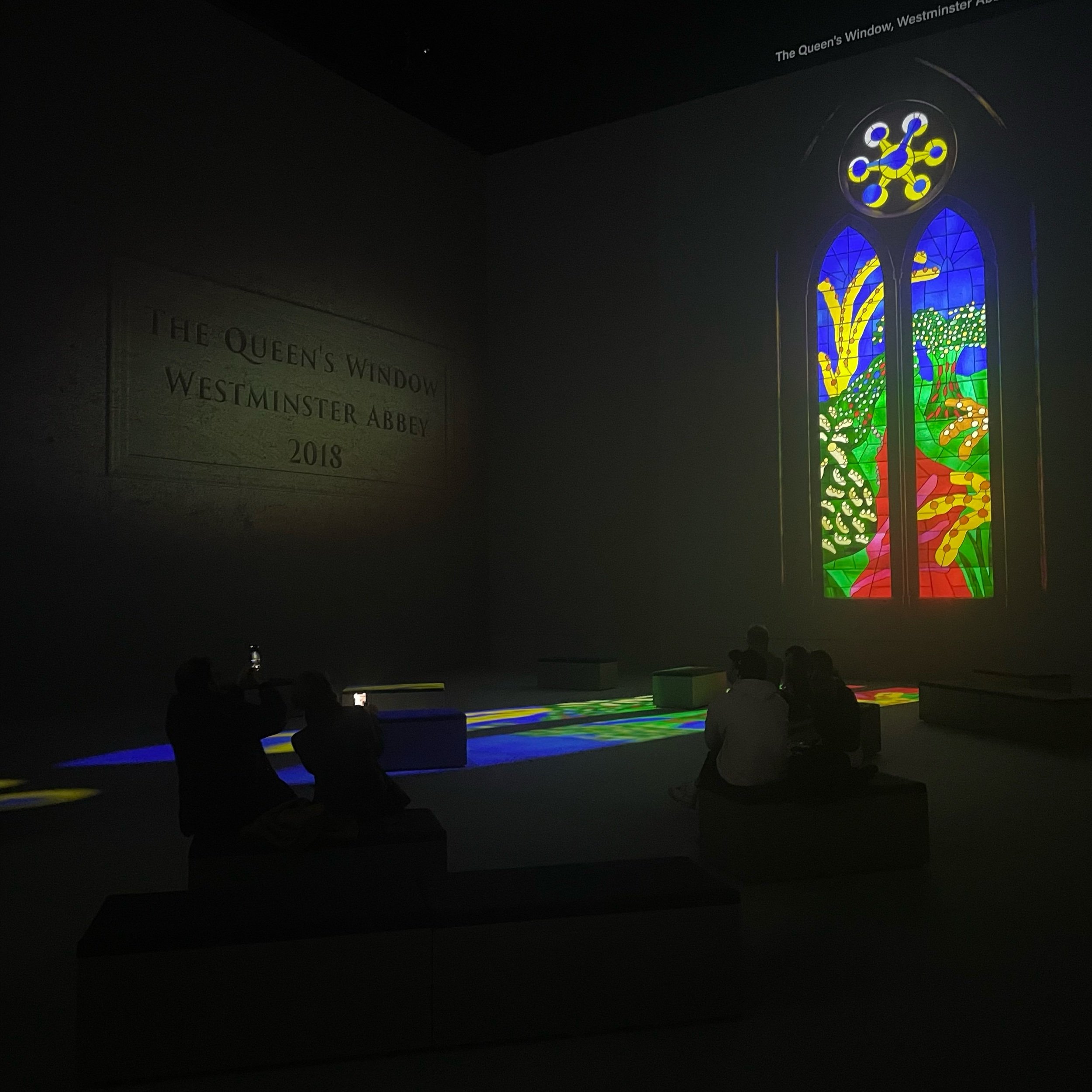
To be fair, there are some moments of pure visual magic. The opening of ‘Looking Closely’ is a brilliantly simple overview of Hockney flipping though his sketchbooks, hinting at the vast output of his career. Later in the show the room goes pitch black, illuminated only by “sunlight” streaming through the stained glass Queens Window he made for Westminster Abbey in 2018. And the entire ‘Hockney Paints the Stage’ chapter is the closest the show gets to what I suspect most visitors would be hoping to see. Hockney created many theatrical backdrops and stage designs throughout his career. Here all the operatic elements are animated, dancing and flying around the room accompanied by their soundtracks, creating one of the most dynamic and engaging moments of the show.
Known for his colourful palettes and use of light, Hockney’s visuals are an obvious choice for this type of venue. It is indeed a treat to see them at such a large scale, and for anyone who’s followed his career it’s a joy to hear him explain the process and thinking behind some of his most famous works, like the monumental Polaroid/photo collages that were decades ahead of their time. But it was a bittersweet watch given how little he seems to have explored or embraced the immersive opportunities possible with such a room. It doesn’t really matter how big or famous something is, when it’s only fleetingly on screen it needs to do more than just float by.
I love David Hockney’s works, and you better love them too or else you’re going to spend a lot of post-Lightroom time thinking about all the things you could have dropped £25 on instead.
Plan your visit
‘David Hockney: Bigger & Closer (not smaller & further away)’ returns, running from 17 Jun - 06 Oct 2024.
Tickets from £25 adult / £15 students & under 18 / children under 5 free
Visit lightroom.uk and follow @_lightroomldn on Instagram for more info about the venue.
Visit hockney.com and the Hockney Wikipedia page for more info about the artist.
A note about the space
Located just behind Coal Drops Yard in Lewis Cubitt Square, Lightroom has a beautiful but modestly sized bar and cafe overflowing with decorative lamps hanging over the central feature: a staircase leading you down into the main space. Yes, there are lifts. It’s hard to find fault with the main (and only) projection room. It’s big, it’s loud, and there are plenty of seats and levels enabling you to sit or stand while enjoying different vantage points. The problem I have is that getting in and out feels like an afterthought.
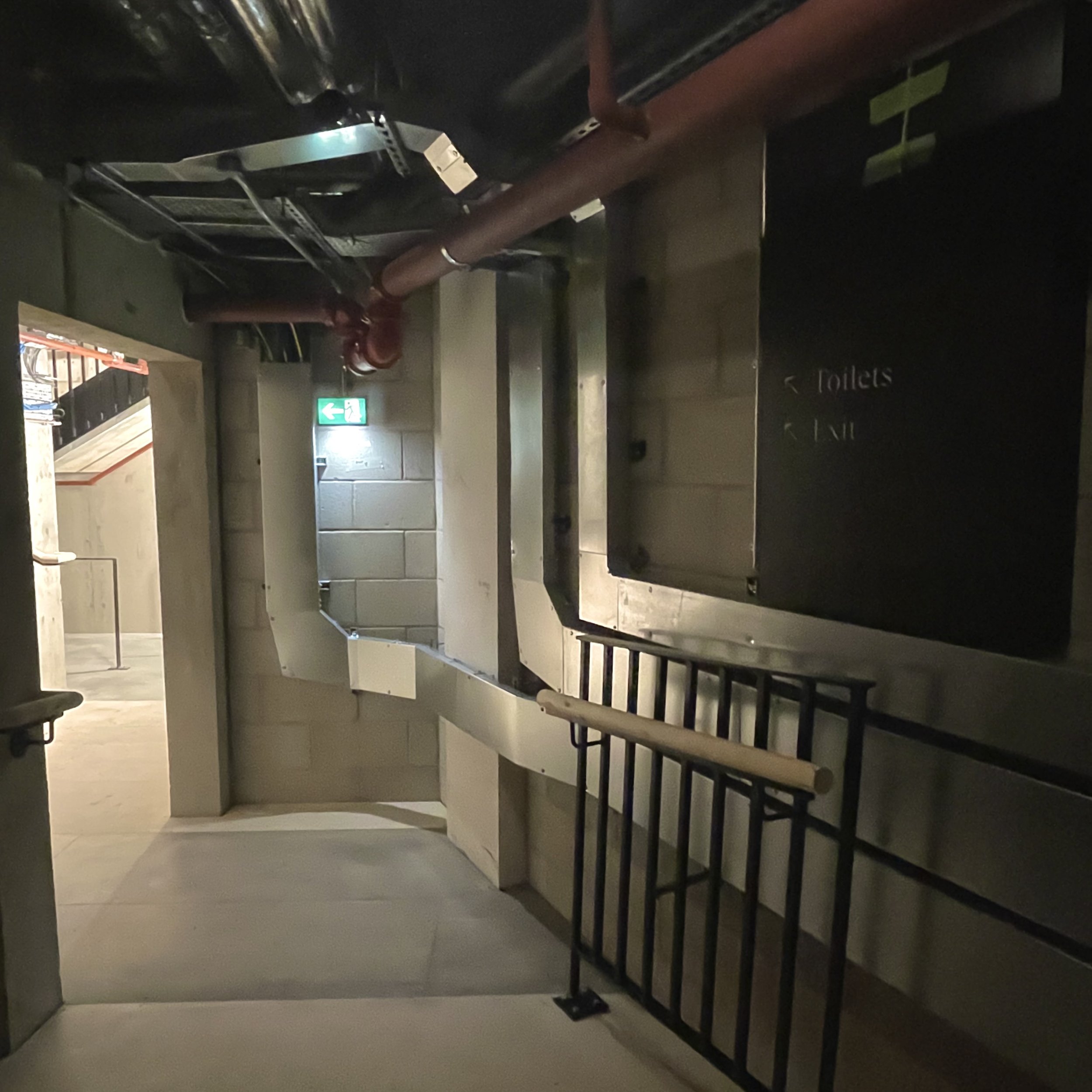
You have to traverse three long, dark narrow corridors, walking on unfinished plywood and underneath exposed ductwork, wires and pipes. It’s a dreary long walk that is shockingly Spinal Tap. The route to the exit is much shorter but just as unappealing (see photo below). It seems like there’s been zero attempt do anything even remotely cosmetic to cover up the fact that you’re in the bowels of a building. Maybe this can be incorporated into the atmosphere of future shows, but it was an underwhelming aspect for a grand opening.
🖼️ Want more art? Visit the What’s On page to see a list of recommended shows, sorted by closing date. Don’t miss ‘em!

