
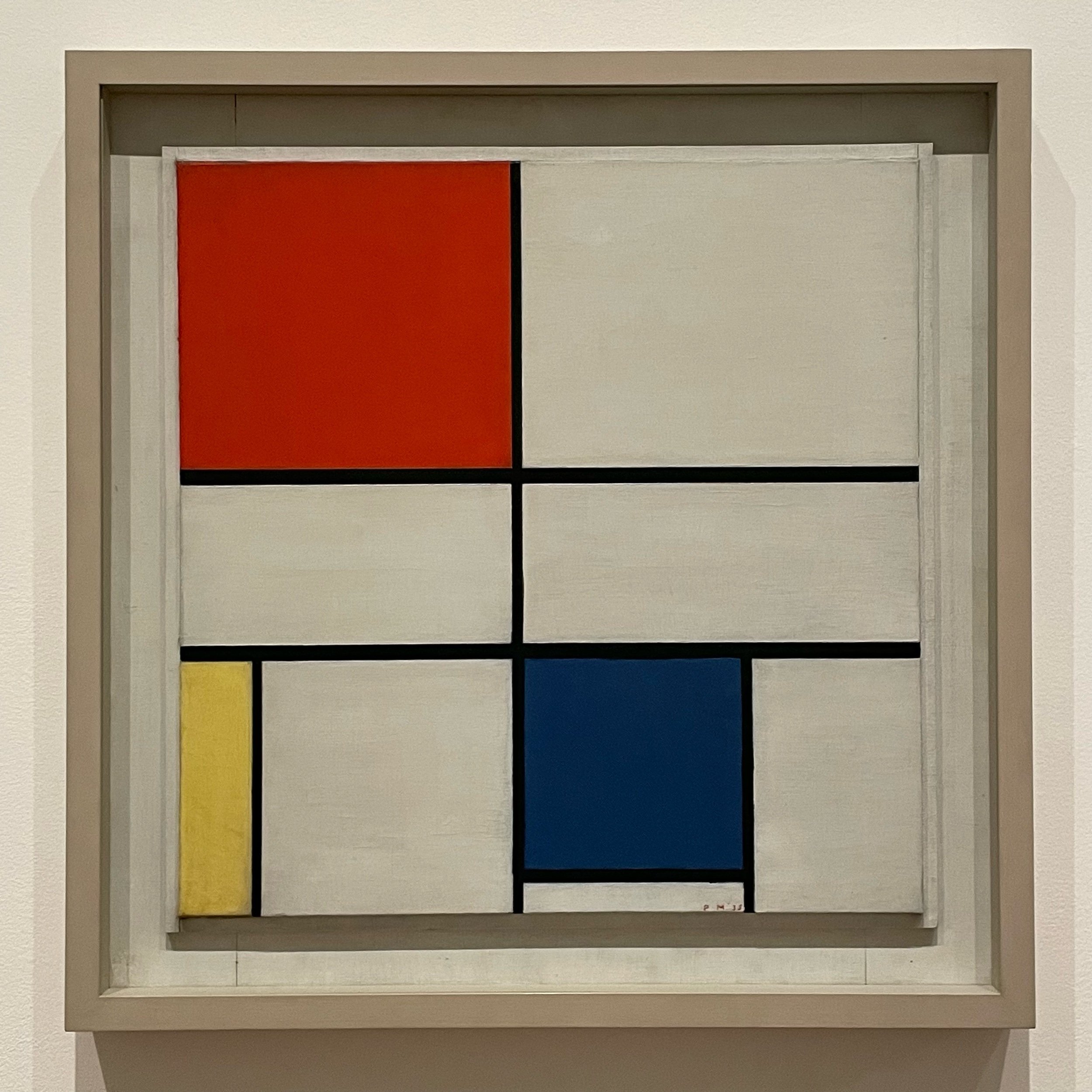
Composition C (No.III) with Red, Yellow and Blue (1935)


Piet Mondrian (1872 - 1944)
Composition C (No.III) with Red, Yellow and Blue (1935)
Oil paint on canvas
560 × 552 mm
Tate Modern
You know this work, even if you don’t know the names — yes, plural, because several variations were made. For reasons I can’t uncover, the order of the colours is inconsistently labelled. I think it might have something to do with how they appear from top left to bottom right, but in a way, that’s irrelevant. Regardless of the title, these works were instrumental to the foundation of modern abstract art.
The version I’ve reviewed, and the imagery used, is “Composition C (No.III) with Red, Yellow and Blue” which is currently on display in the Tate Modern. I often refer to it as the gateway drug to abstract art, and that’s the reason I like it. Well, one of them.
I wholeheartedly acknowledge that abstract art can be off-putting and incomprehensible. A lack of recognisable imagery (people, trees, etc) is often confusing to many people, who just want to know what it is they are looking at. Yet abstracts have continued to be a mainstay of artistic output for over a hundred years. If it weren’t for abstract art, Susie Hodge’s book “Why Your Five Year Old Could Not Have Done That” would have been a pamphlet.
Which brings us back to Mondrian’s basic colour compositions. I like them because they are abstract, but inviting. His clear, geometrically simple composition using primary colours appeals to basic human instincts for order and familiarity. Or in plain English, it’s easy on the eyes. I like looking at it. It makes me smile. Its orderly but not overly busy, yet not so simple as to appear uninteresting. More importantly, it doesn’t appear accidental or random.
With a quick first glance you might assume it’s a basic symmetrical four-square design. In actuality, there are nine polygons, and no two are the same size. The Red and Yellow shapes appear to abut the edges, but in fact wrap over and around them, extending down to the base (Images 2-3). Are these actually painted shapes, or individually thick plates attached together? One answer may come from the fact that none of the black lines extend beyond or over the top plane. If you look close enough at those black lines, you’ll also notice that they’re all a different width. It doesn’t take a lot of looking to realise that something so seemingly simple has, in fact, required lot of thought and a considerable number of artistic decisions. Which is something people conveniently disregard when abstract art skews too close to chaos (Jackson Pollock) or calm (Yves Klein).
In addition to being an easy introduction to abstract art, there’s one more reason I like it. It’s something I never fully appreciated until I saw this work in person and up close: It’s messy.
Take a look at Image 6, a close-up of one of the white rectangles. The brush stokes are exposed, uneven and inconsistent. I’d fire my house painter if my walls looked like this. Now check the edging between the shapes in Images 4, 5 and 7. For something so intentionally orthogonal there’s a surprising softness to the corners and barely a consistent hard edge to be found. Admittedly, I almost had to press my nose to the safety glass to notice these details. But they’re important to call out, because the common assumption is that those messy details don’t even exist.
In person, the quality of an artwork may sometimes surprise. The rough, raw finish of this work was not what I had expected — and was initially quite off-putting. That’s because I’d become far too accustomed to the modern reproductions and homage items that have flooded museum gift shops. I invite you to open a new browser window/tab and do an image search on “Mondrian”. You’ll be presented with hundreds, if not thousands, of crisp grids of red, yellow, blue and stark, ultra-bright white. Most of these won’t even be actual Mondrian paintings! This work has entered the visual vernacular, and is now to be found on everything from posters and socks to furniture and wall clocks. All of them with super vibrant primary colours separated by razor sharp lines.
I don’t think Mondrian would have cared. While his noticeable brush strokes were intentional, they were there in a supporting role for a much bigger idea. An idea he eventually progressed to paint variations of that were more complex, more colourful and yes, more crisp and clean. But it was his early 3-colour combination that made a bold but approachable statement about abstract art that, despite the messy marks, struck a nerve and has continued to influence ever since.
That’s why I like it.
When something becomes this ubiquitous, you should always go back to the source for closer look.
PLUS…
Check the What’s On page so you don’t miss any great shows closing soon.
Subscribe to the Weekly Newsletter. (It’s FREE!)